Having a beautiful light and airy kitchen has always been something I’ve dreamed of. But kitchen renovations are EXPENSIVE so I held off for a long time. When we sold my house in Charlotte this past year we decided to put aside some of the money from the sale towards our biggest house project yet… our kitchen renovation. Now let me preface this by saying I knew it was going to be a long and expensive project, but I didn’t realize just HOW long it would be before our kitchen was FINALLY done and just how much money we would end up putting into it! However, in the end it was totally WORTH IT!
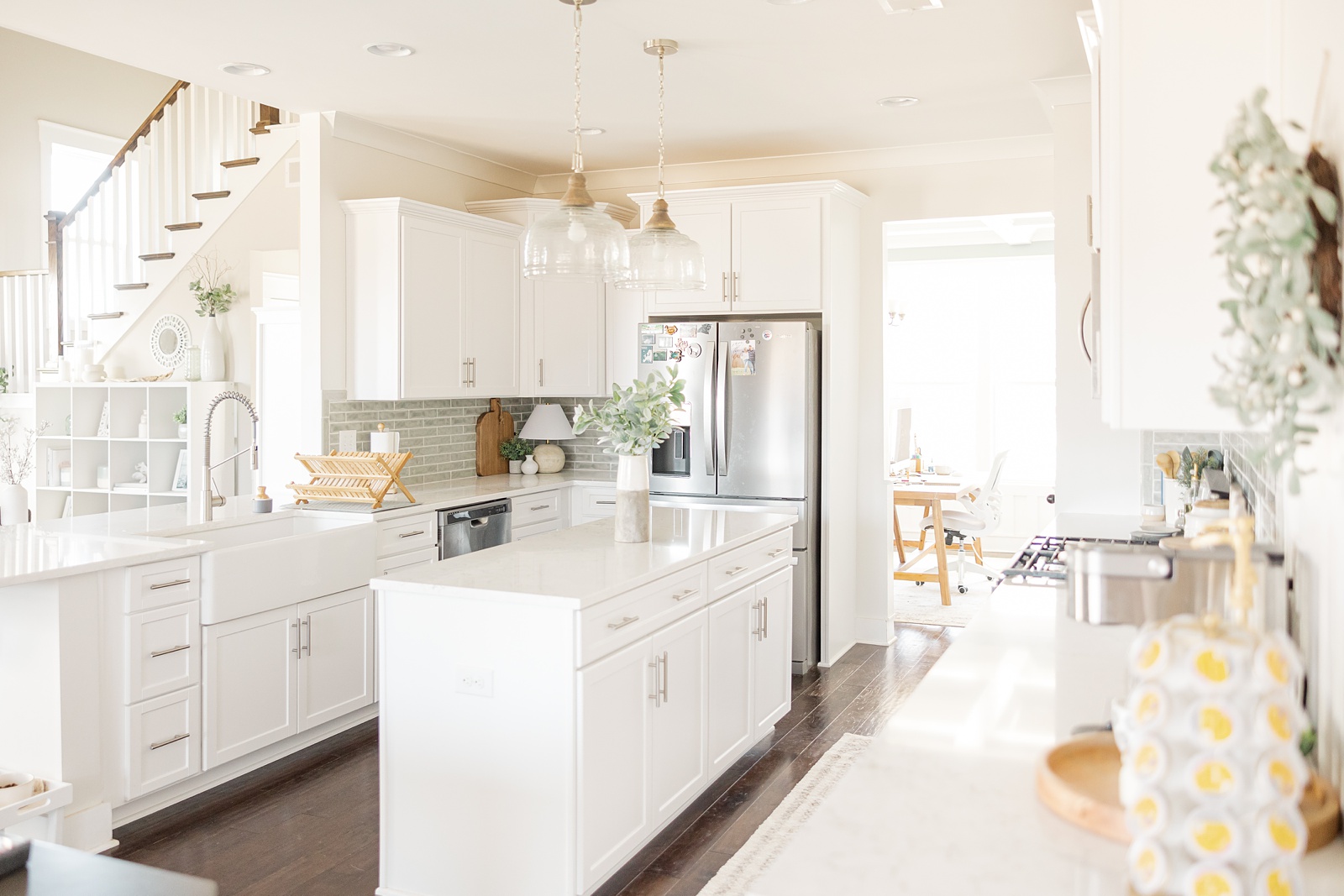
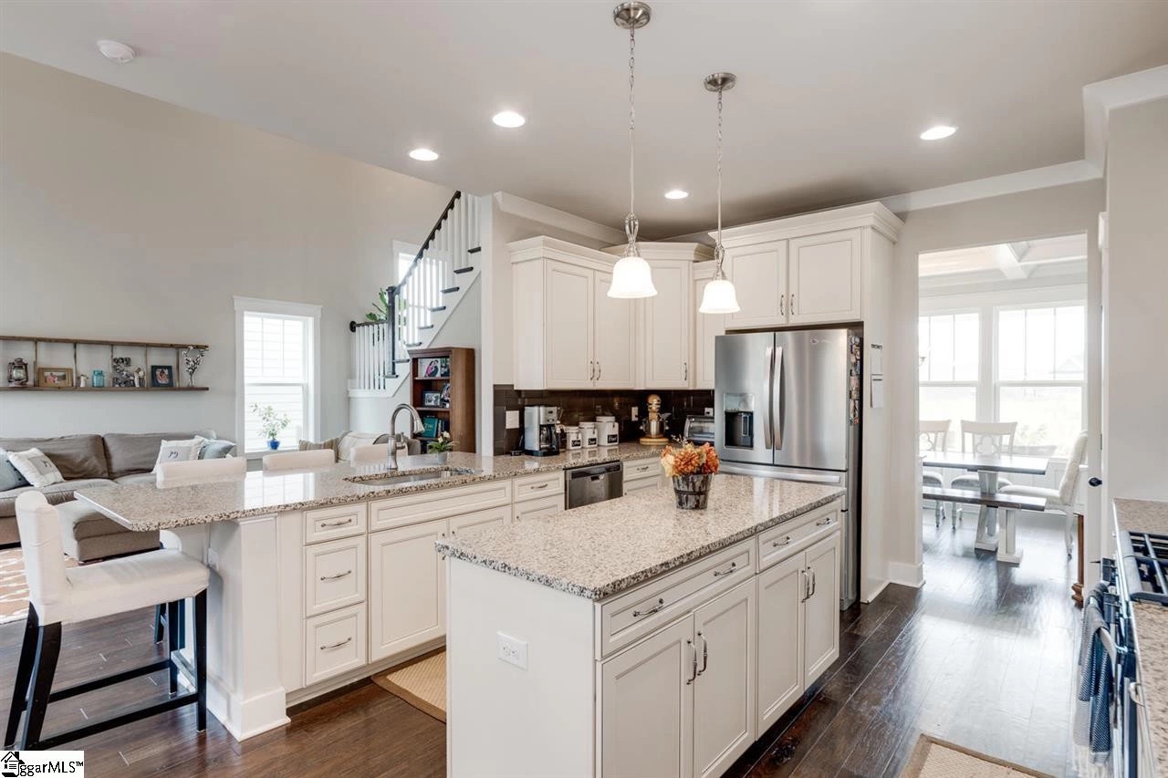
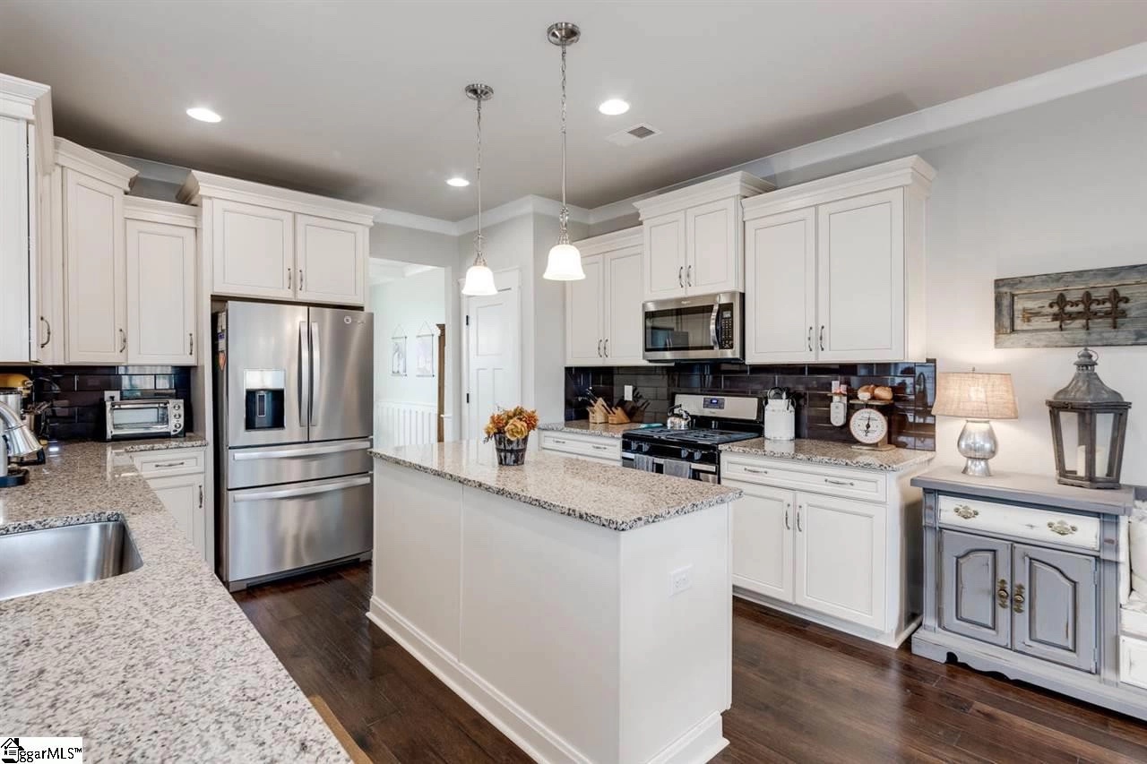
Overall our house is full of crisp white details and clean lines, which is perfect, but when we moved in there were a few rooms that just didn’t seem to match. If you read my earlier post from our Half-Bathroom Makeover then you know what I mean. The kitchen was the same. It had dark charcoal backsplash tile, granite with a brown/beige/black color mix and the cabinets were an ivory color with charcoal detailing. It just felt sort of heavy considering how open the floorplan is. I knew I definitely wanted to replace 3 things: the counters, tile and cabinets.
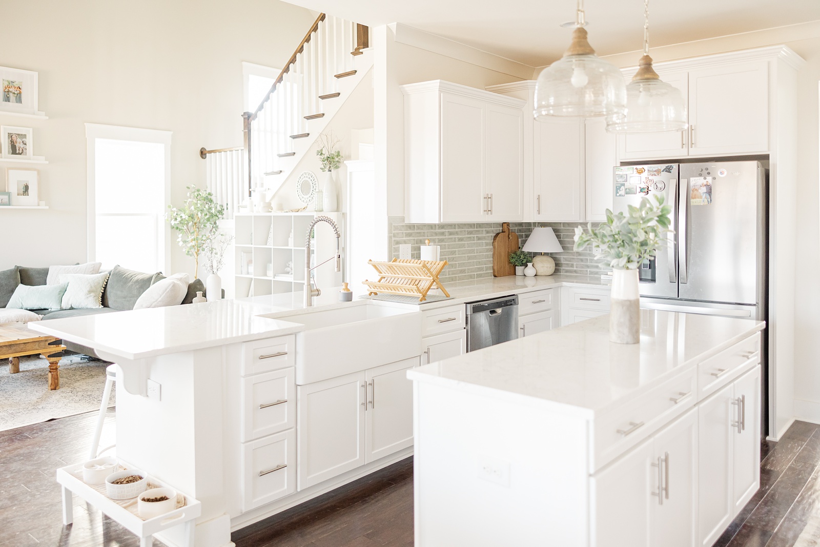
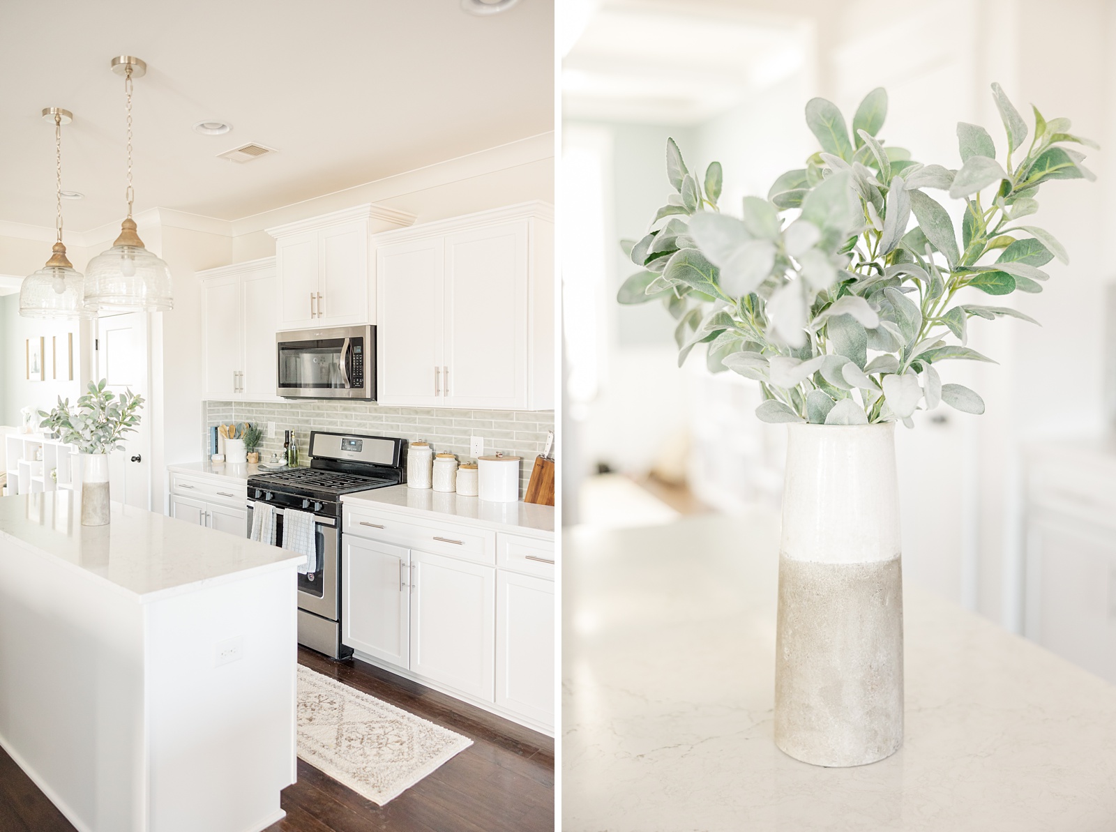
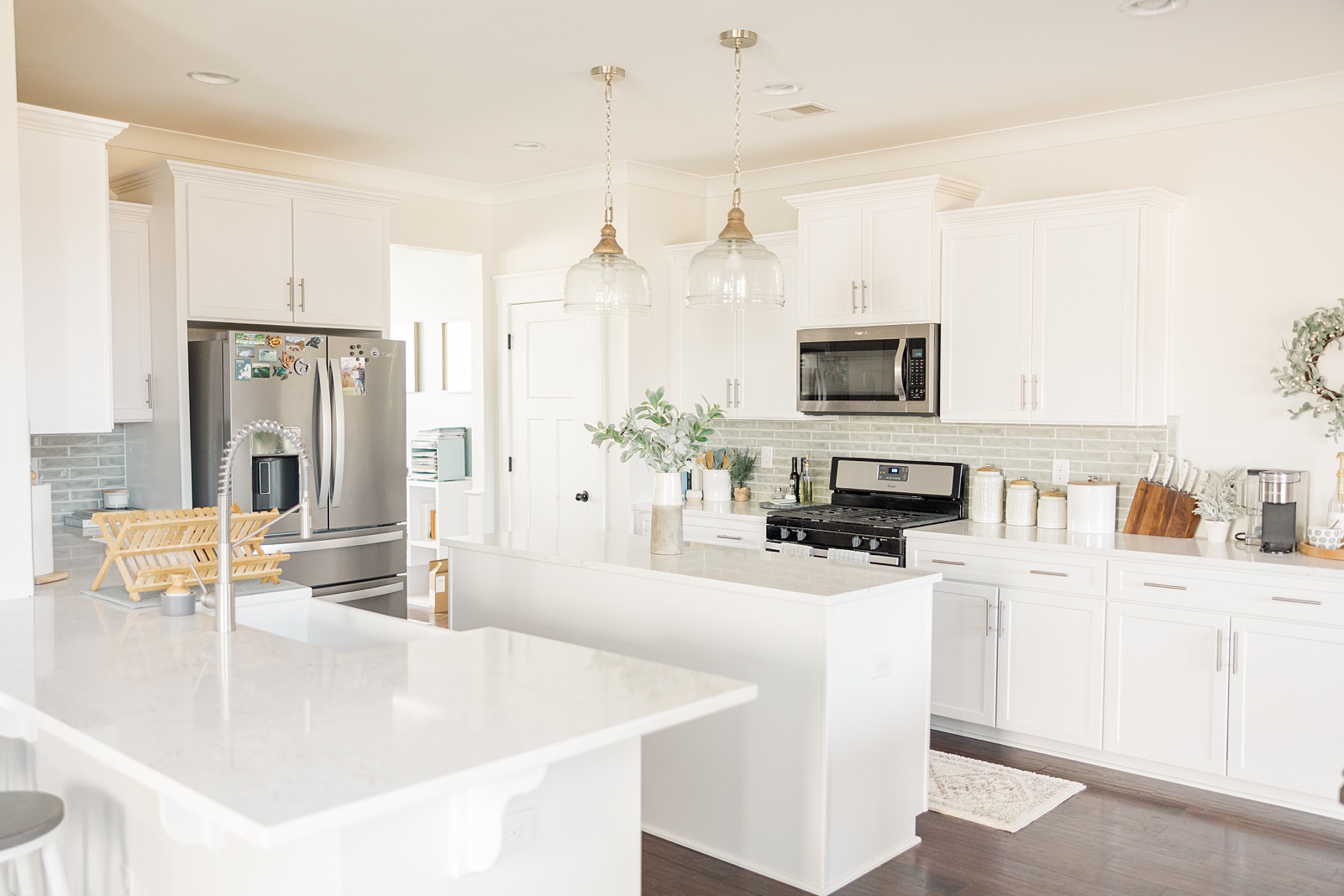
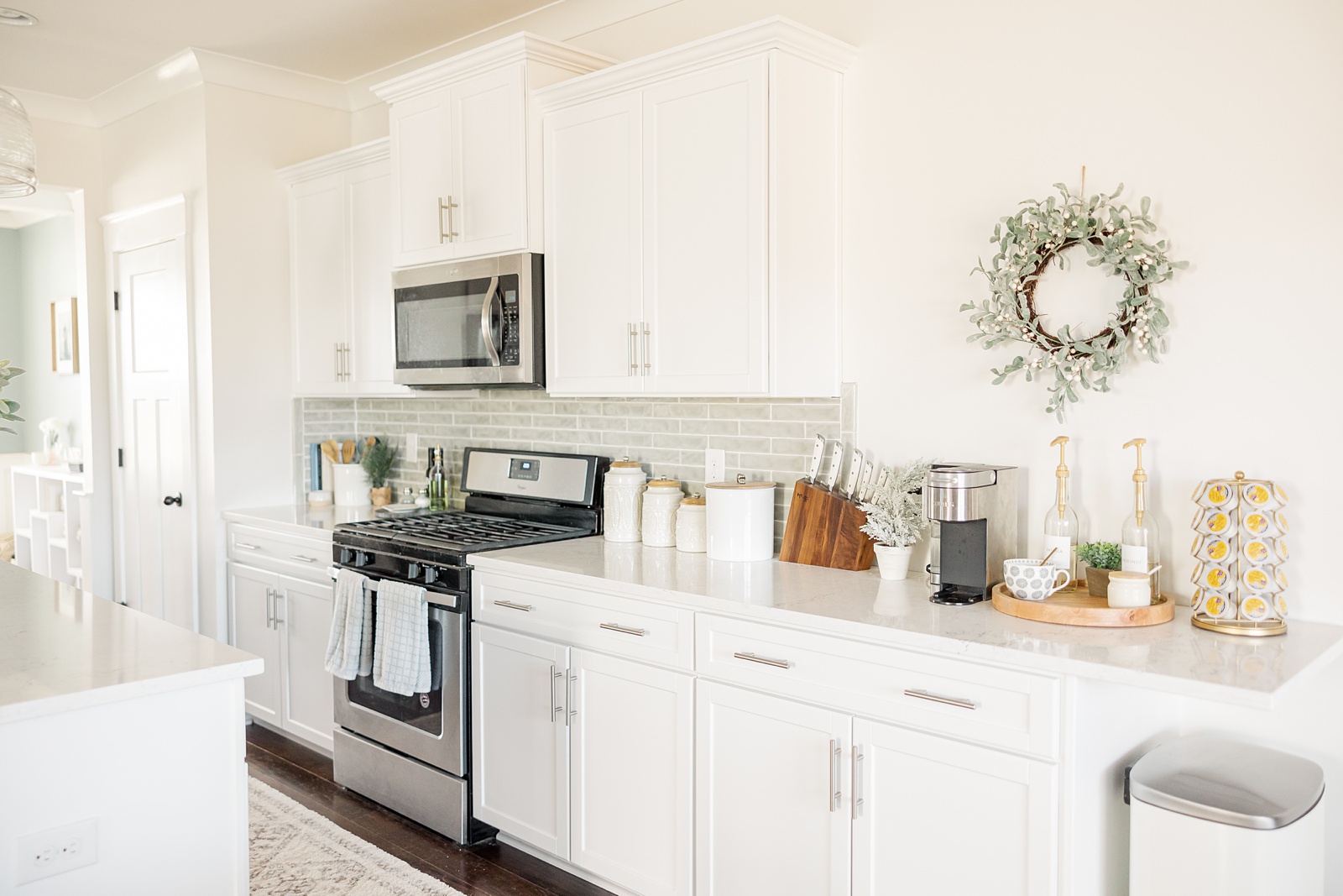
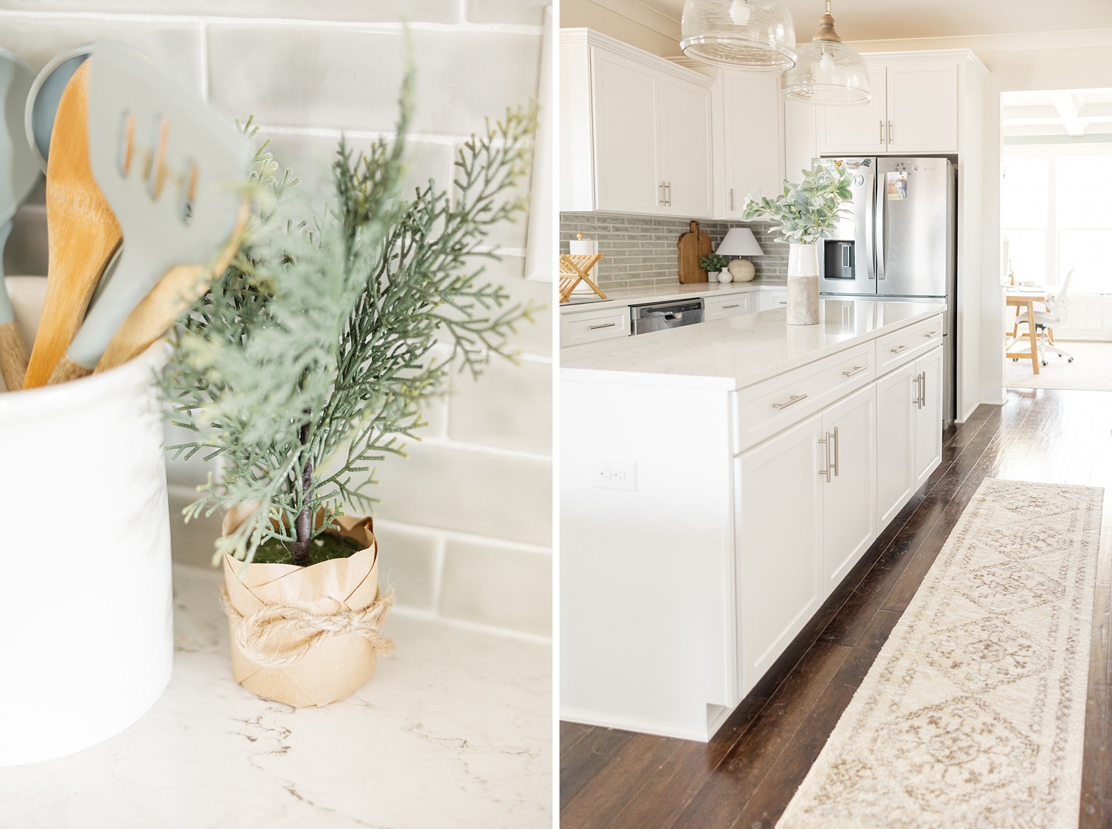
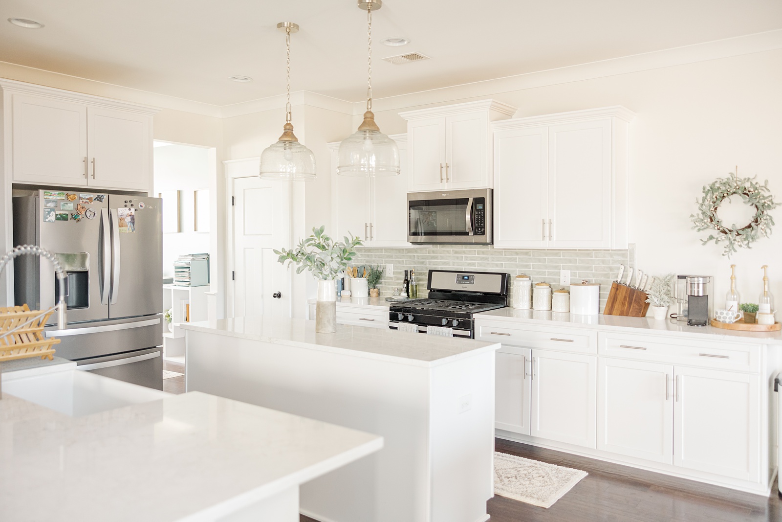
We chose to re-face our cabinets instead of completely replacing them since they were actually good quality cabinets. This saved us quite a bit of money. Essentially they put in new doors and drawer-fronts, new hardware, new soft-close hinges and drawer slides, and then added new white vinyl to the outside of the cabinets to match the doors. They also put in new crown molding on the upper cabinets. We went with a simple white shaker-style door and brushed nickle rod handles.
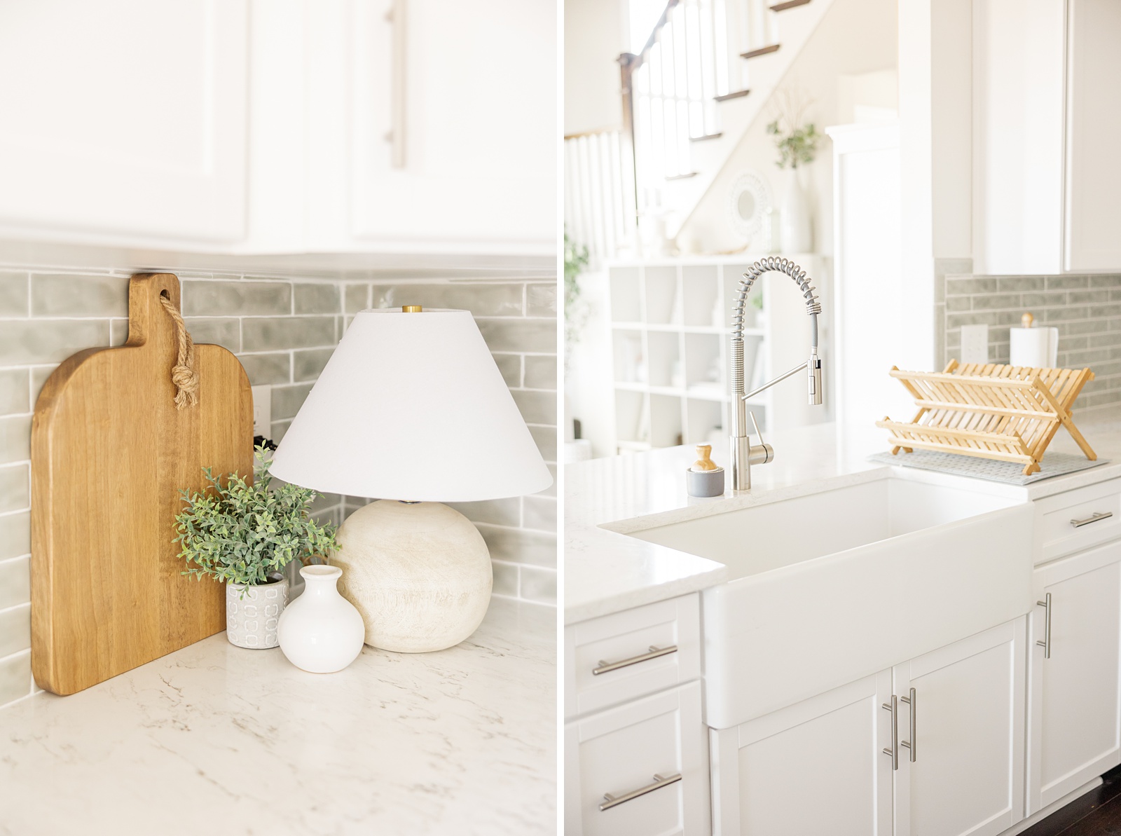
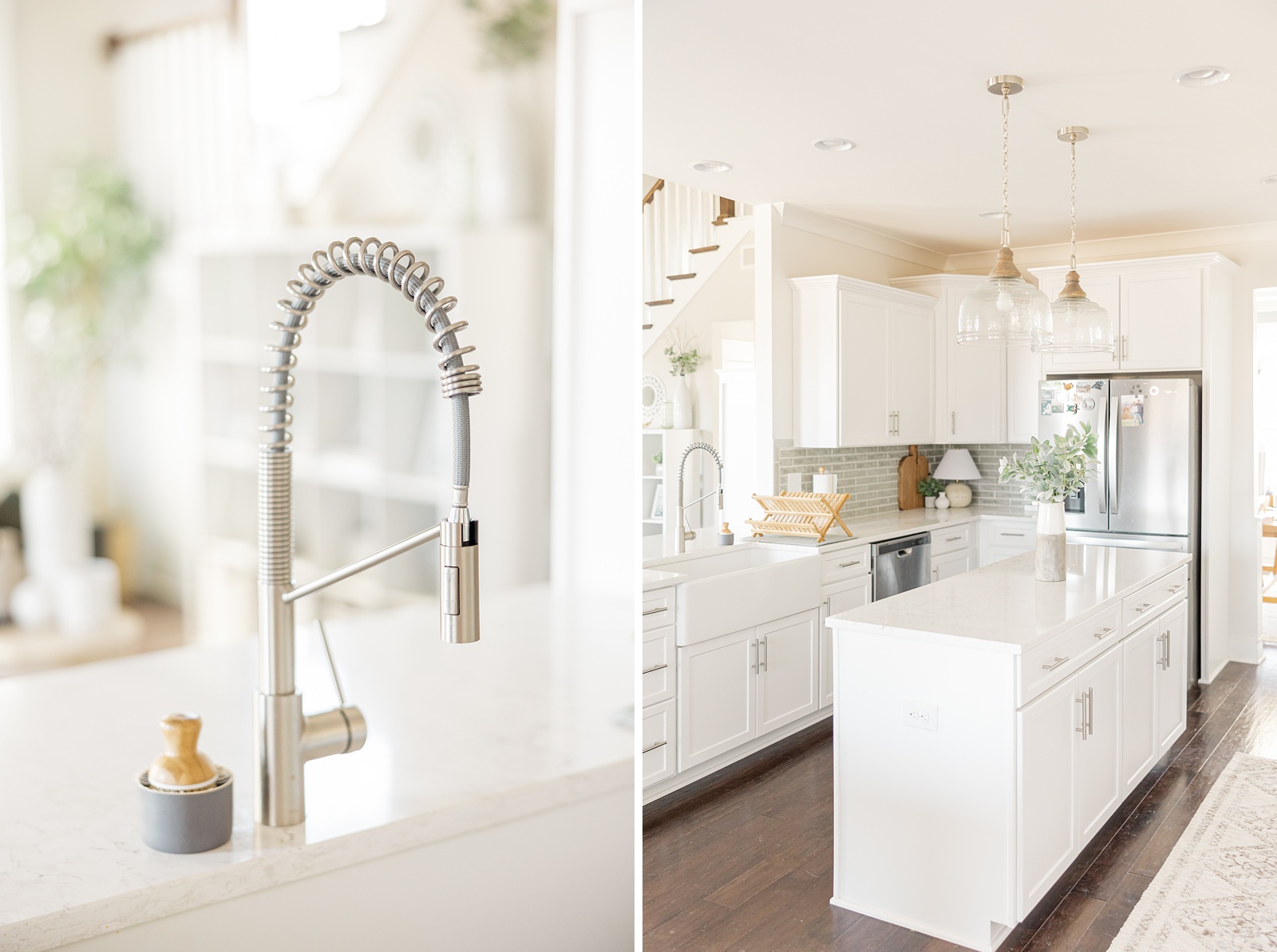
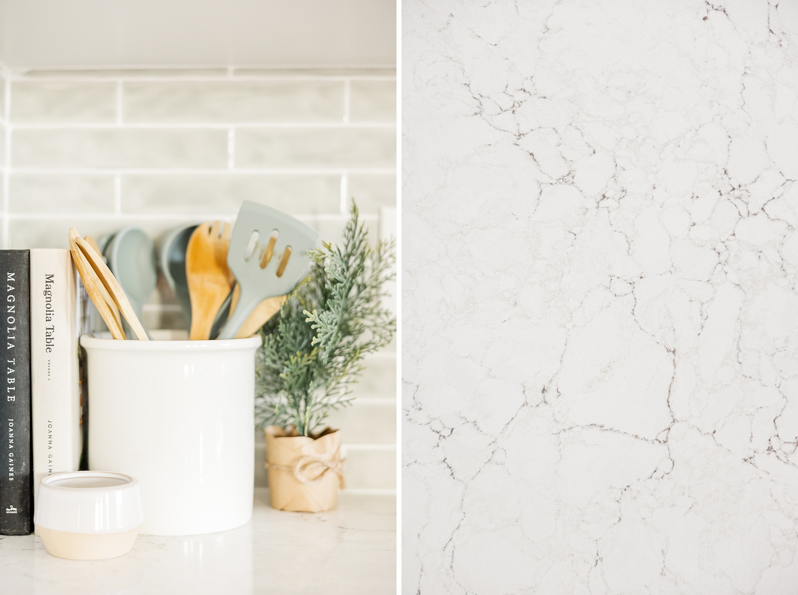
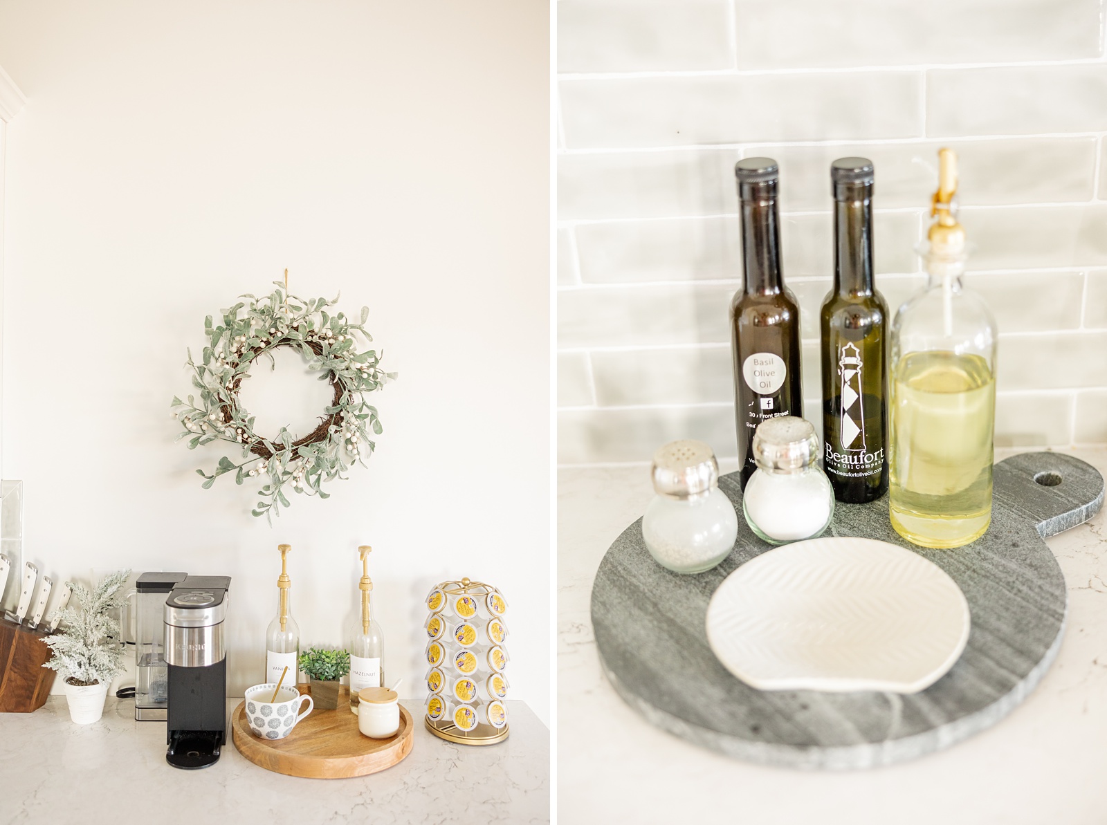
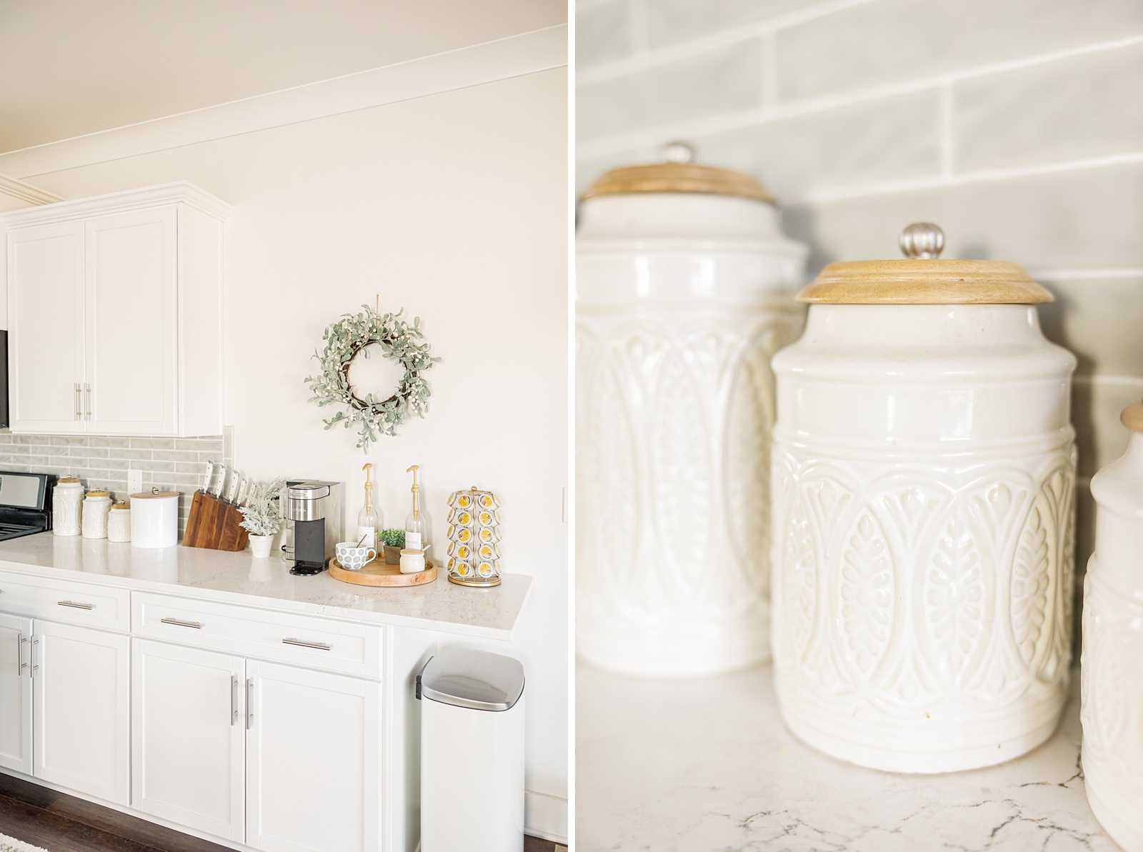
For the counter tops we chose Dovestone by Cambria, which is a white quartz with light grey and black veining throughout. I love the subtle pattern and just a touch of contrast! This was where we ran into some snags with this kitchen renovation and ended up replacing the sink and faucet as well. I have always wanted a farmhouse sink and this was my chance to have one! We also decided to extend our counters on one end for more storage and space so we added in another base cabinet and then included an overhang on top of that, which gave us an extra 8 sq ft of counter space!
For the backsplash tile, we decided on a 2×10 polished ceramic tile in a color called Seaport from Tile Bar. It’s such a beautiful blue/green/grey color that accents our kitchen as well as the rest of the decor in the house. The polished ceramic gives it a slightly more organic look and feel and the elongated size adds just a little bit of uniqueness. We used bright white grout for contrast and a clean look.
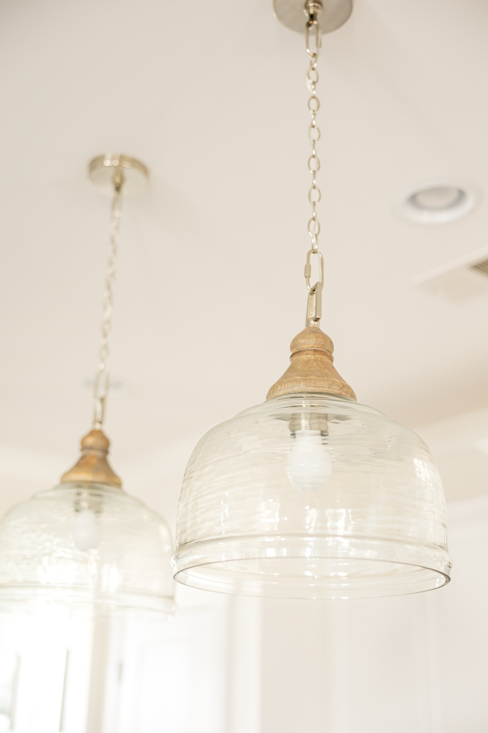
The last things were the pendant lights, pull-down faucet and white apron-front farmhouse sink! I absolutely LOVE how this project turned out and honestly, it’s made me want to keep the kitchen cleaner because I just love it so much haha. Ryan and I cook almost every night so we use it quite a bit and it’s honestly become one of my favorite rooms in the house! But now I’m spoiled and I’m going to want any future houses to have a kitchen just as beautiful. I hope you enjoy this kitchen renovation as much as I do! Scroll to the end to see the before photos from when we bought the house.
leave a comment